Charts
DataOn-chain
VIP
Market Cap
API
Rankings
CoinOSNew
CoinClaw🦞
Language
  • 简体中文
  • 繁体中文
  • English
Leader in global market data applications, committed to providing valuable information more efficiently.

Features

  • Real-time Data
  • Special Features
  • AI Grid

Services

  • News
  • Open Data(API)
  • Institutional Services

Downloads

  • Desktop
  • Android
  • iOS

Contact Us

  • Chat Room
  • Business Email
  • Official Email
  • Official Verification

Join Community

  • Telegram
  • Twitter
  • Discord

© Copyright 2013-2026. All rights reserved.

简体繁體English
|Legacy

From a more detailed perspective of the exchange traffic data

CN
Phyrex
Follow
3 months ago
AI summarizes in 5 seconds.

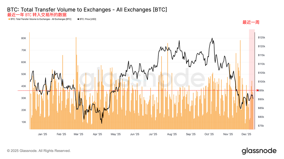
From a more detailed perspective on exchange flow data, if the amount of BTC flowing into exchanges is considered a reflection of investor panic, we can see that investor panic has been improving over the past three weeks, with weekly inflows to exchanges decreasing and remaining relatively stable.

Data on BTC inflows to exchanges over the past year

However, this stability is still somewhat different from the heightened FOMO emotions in July and September. As I have mentioned many times before, the increase that started in April was not due to a dramatic change in buying volume, but rather a significant decrease in selling volume, which can be clearly seen in this data.

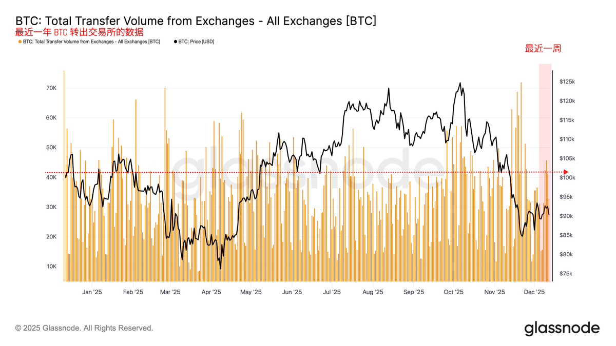
Data on BTC outflows from exchanges over the past year

If we consider the BTC transferred out of exchanges as a sign of optimistic sentiment, we can clearly see that when the amount of BTC flowing out of exchanges is high, it often corresponds to either a rising cycle or a price peak. Of course, the overlap of these two charts may not be very clear, so we can look at another chart.

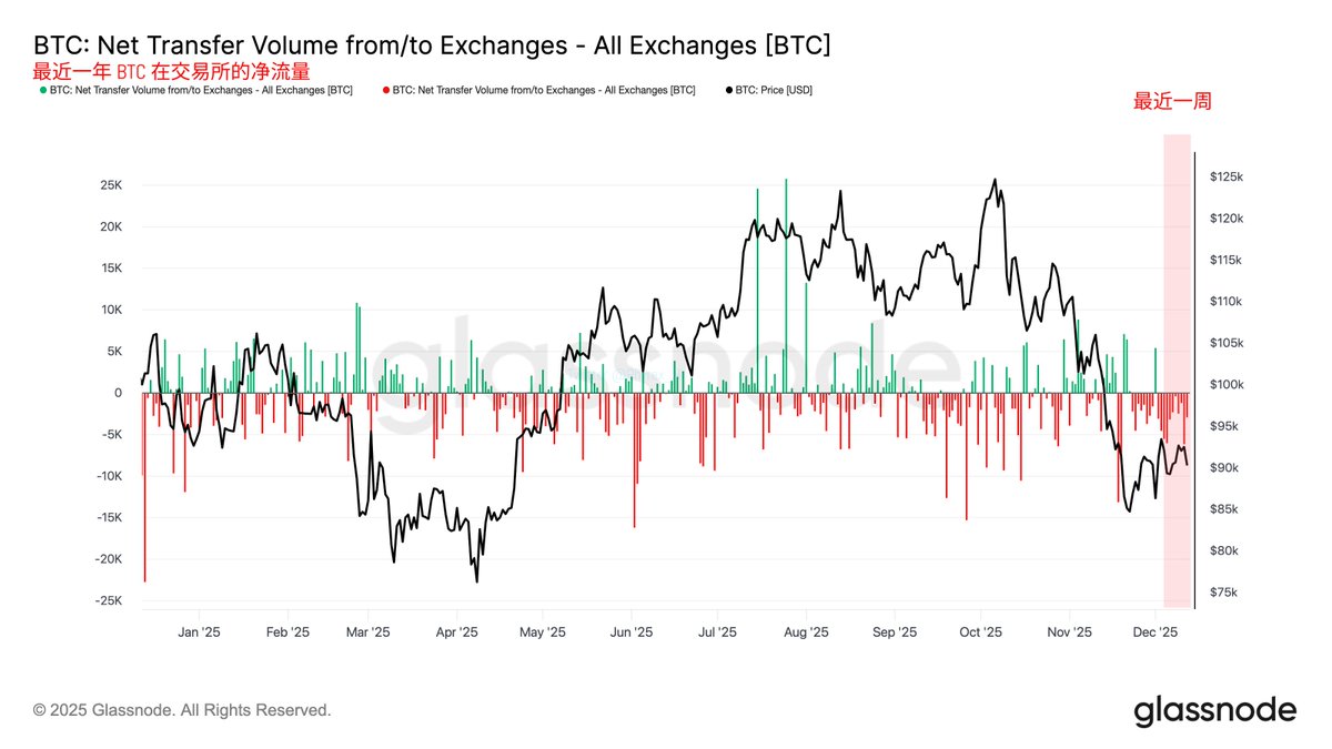
Net flow of BTC on exchanges over the past year

This chart shows the net flow data of exchanges over the past year, which simply means the result of inflows minus outflows. The green line on the horizontal axis indicates a positive balance for that day’s inflows and outflows, while the red line represents a negative balance. The former indicates net inflow, while the latter indicates net outflow.

In general, when the BTC flowing out of exchanges daily exceeds the inflows, it represents a stronger sentiment among investors to buy (bottom-fish), and we are currently in this state.

Bitget VIP, lower fees, better benefits

免责声明:本文章仅代表作者个人观点,不代表本平台的立场和观点。本文章仅供信息分享,不构成对任何人的任何投资建议。用户与作者之间的任何争议,与本平台无关。如网页中刊载的文章或图片涉及侵权,请提供相关的权利证明和身份证明发送邮件到support@aicoin.com,本平台相关工作人员将会进行核查。

交易抽顶奢帐篷,赢小米新 SU7!
广告
|
|
APP
Windows
Mac
Share To

X

Telegram

Facebook

Reddit

CopyLink

|
|
APP
Windows
Mac
Share To

X

Telegram

Facebook

Reddit

CopyLink

Selected Articles by Phyrex

1 hour ago
Just thinking that today is a holiday.
1 hour ago
CZ's new book seems to not be available on Amazon Singapore.
2 hours ago
Written quite well.
View More

Table of Contents

|
|
APP
Windows
Mac
Share To

X

Telegram

Facebook

Reddit

CopyLink

Related Articles

avatar
avatarDelphi Digital
1 hour ago
Morpho is becoming the lending backend for institutions
avatar
avatarPhyrex
1 hour ago
Just thinking that today is a holiday.
avatar
avatarPhyrex
1 hour ago
CZ's new book seems to not be available on Amazon Singapore.
avatar
avatarPhyrex
2 hours ago
Written quite well.
avatar
avatarPhyrex
2 hours ago
CoinGlass Q1 2026 Cryptocurrency Market Share Research Report Q1 2026 Centralized Exchange Data #Binance remains the only platform in the entire industry that ranks first simultaneously in four core dimensions: derivatives trading, average positions, order book depth, and user asset accumulation.
APP
Windows
Mac

X

Telegram

Facebook

Reddit

CopyLink