First of all, let me make it clear: the footprint chart is not meant to replace candlestick charts; it helps you understand what is really happening behind the candlestick charts.
Ordinary candlesticks can only show us superficial data such as opening, highest, lowest, and closing prices.
But you cannot know whether the active buying funds behind a particular candlestick really pushed the price up.
You also cannot see whether the active selling force truly brought the market down.
Let's first present an image to help everyone understand what the footprint chart looks like. The details that these candlesticks cannot reveal will be fully presented by the footprint chart.
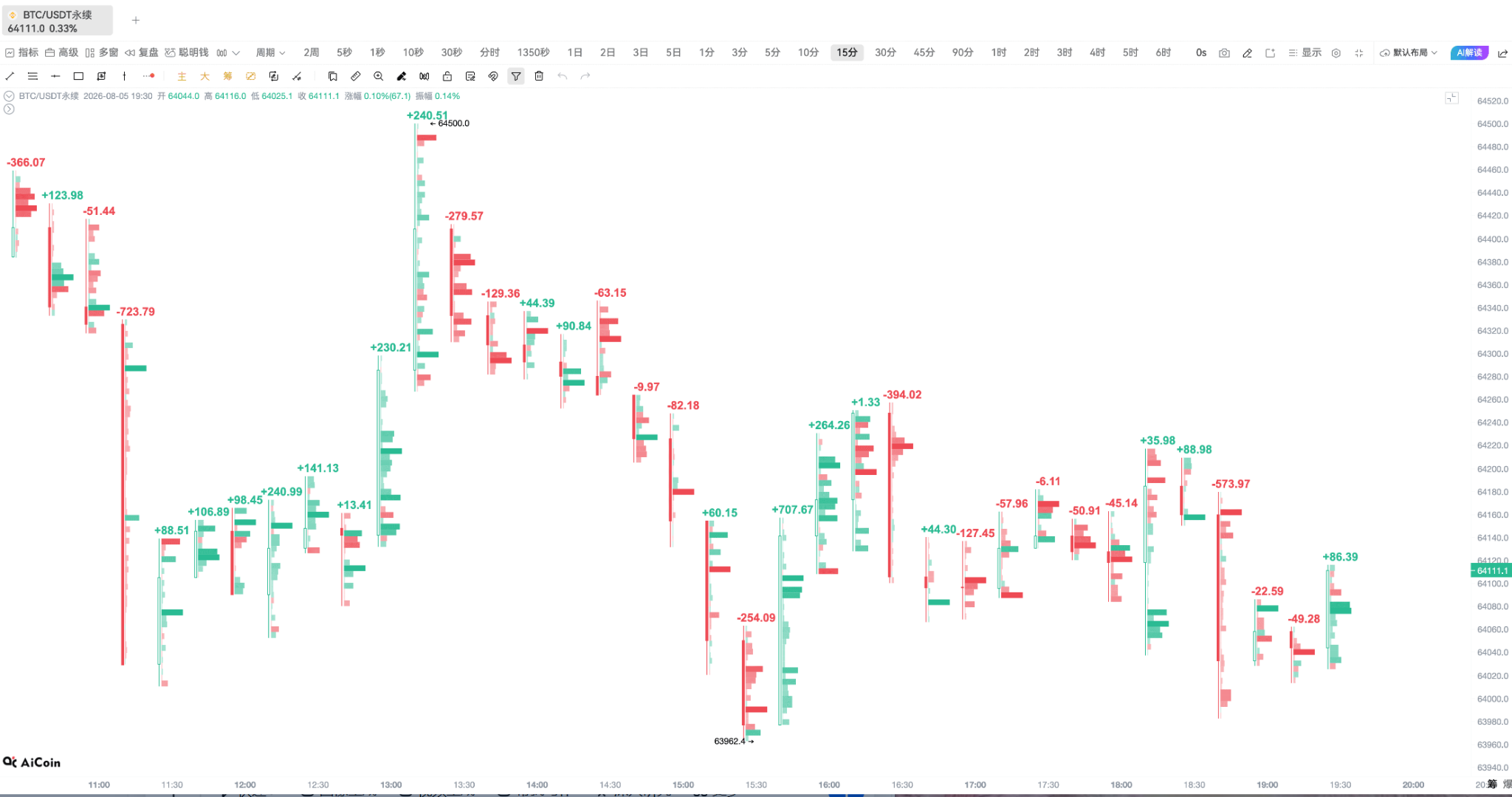
It will break down each candlestick and display the active buy and sell transactions that actually happened at each price level.
Let me briefly introduce this tool; we will break down more details in conjunction with images later.
When you open the footprint chart, you will see not just the results of price changes but the real battle of funds between buyers and sellers that occurred when a candlestick was formed. Here is the image.
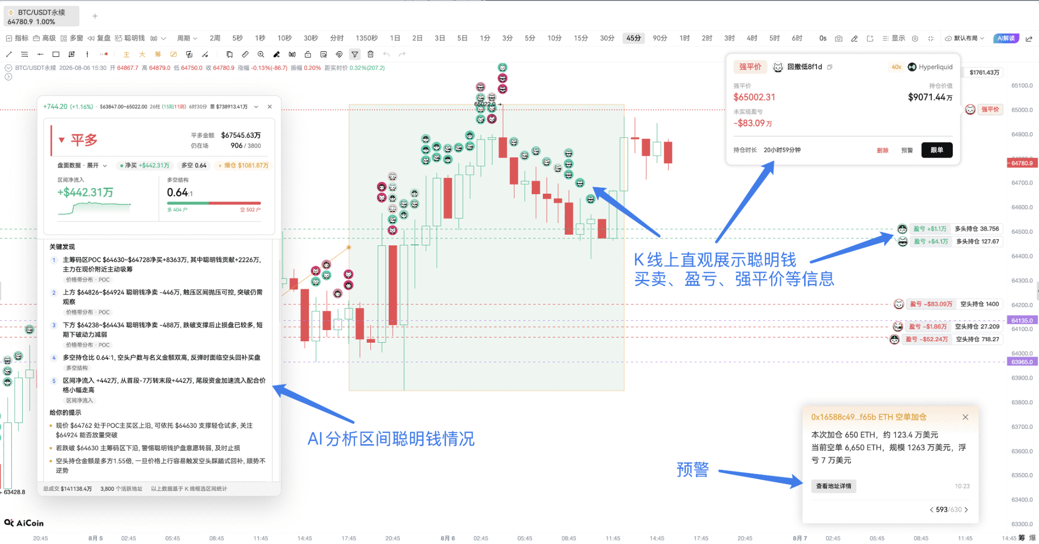
On-chain members can now enable practical indicators such as whale opening and closing position markers, cost lines, liquidation prices, and order prices on the candlestick interface. Additionally, AI fund interpretation and market alerts are included.
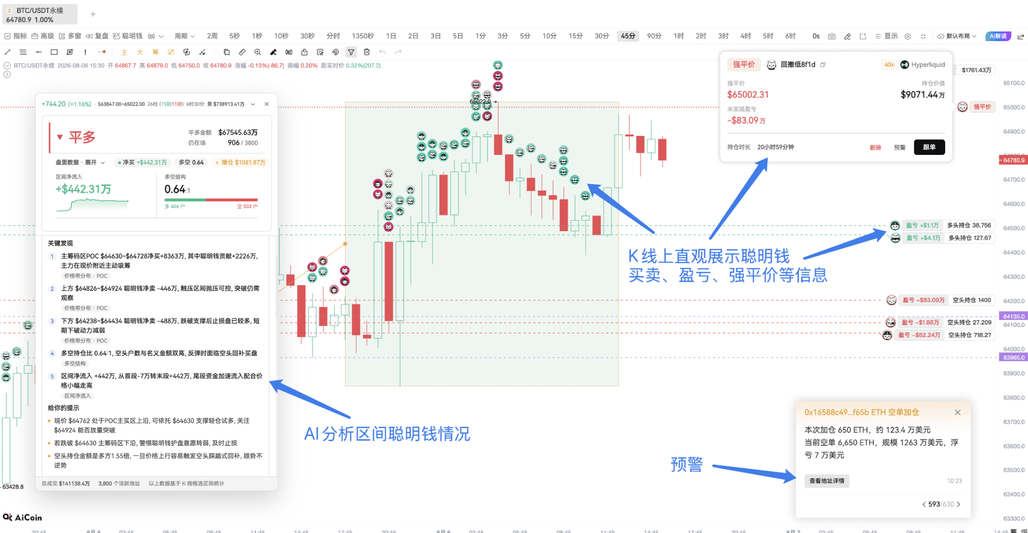
This rights activity is not long-lasting, so friends who need it should pay attention.
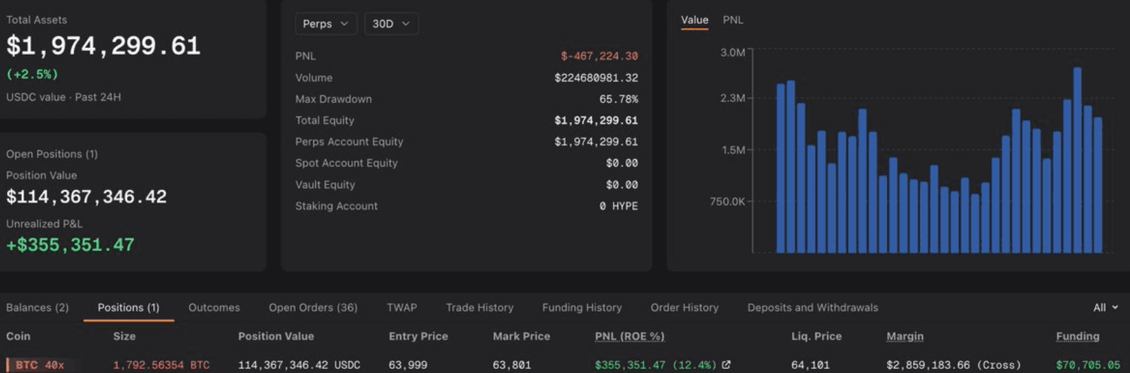
In the next couple of days, keep an eye on the whale that is shorting BTC.
Its liquidation price is very close to the current market price of BTC.
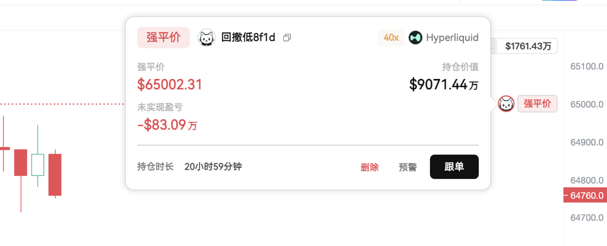
Footprint chart entry
Click on the corresponding function to view it.
Through the footprint chart, you can clearly see the true movements of active funds, which is key to understanding market trends. Our set of footprint chart rules is left for buying and right for selling.
The green on the left represents active buying pressure.
It indicates that funds are actively absorbing sell orders in the market and are willing to buy in at market prices.
What is meant by active is market orders.
The red on the right represents active selling pressure.
It means that funds are actively absorbing buy orders in the market and are selling at market prices.
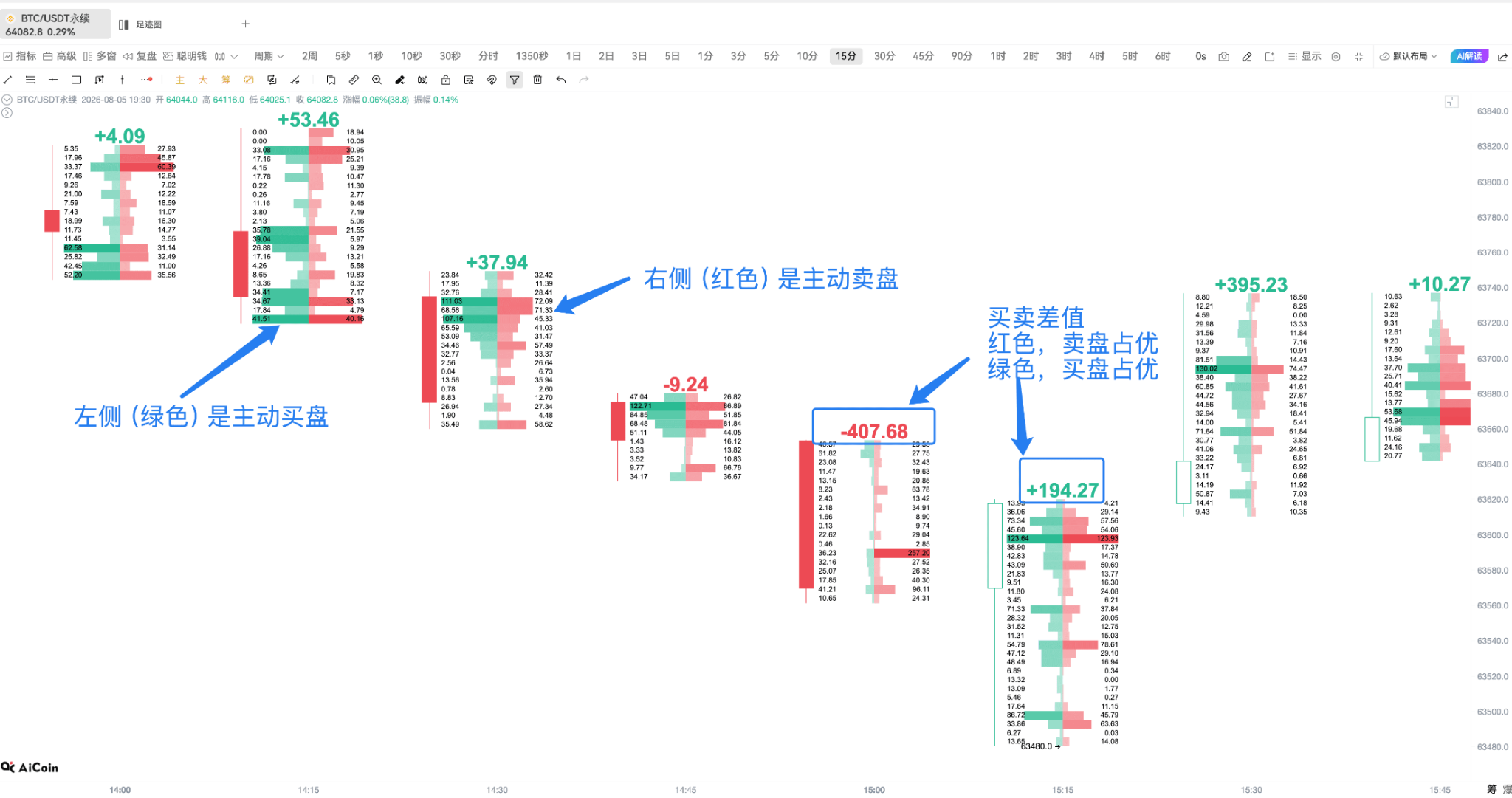
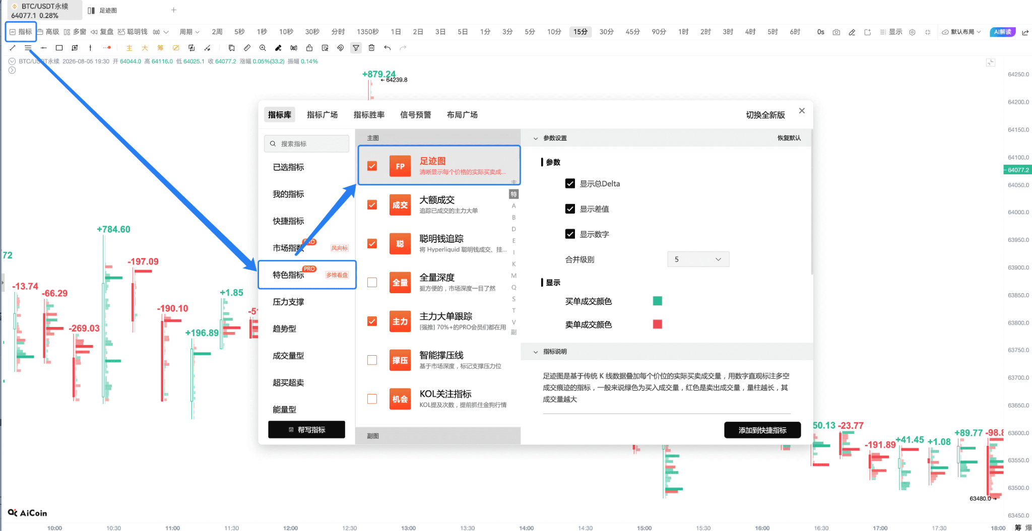
Each horizontal price line records all transactions that occurred at the corresponding price level in this candlestick.
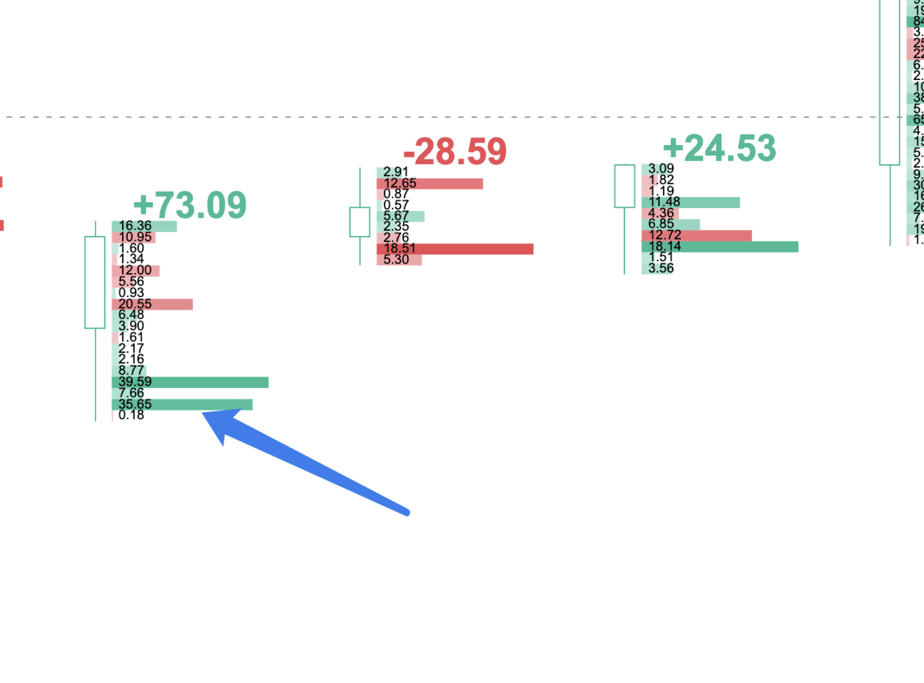
I personally prefer to adjust it to difference mode so I can quickly distinguish which side, buy or sell, has the upper hand at the same price level.
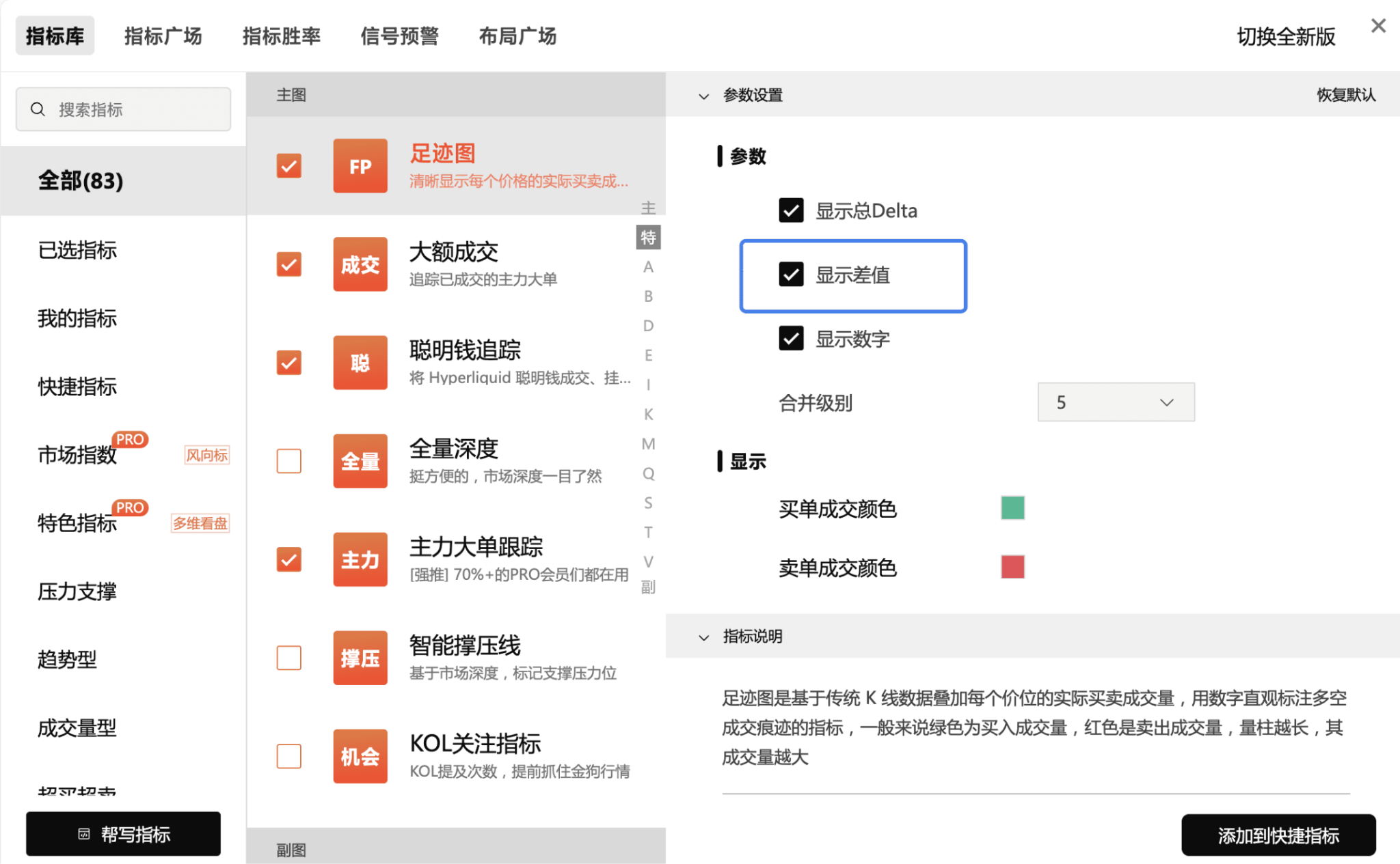
If the green bars dominate, it indicates stronger buying power; if red bars dominate, it indicates stronger selling power.
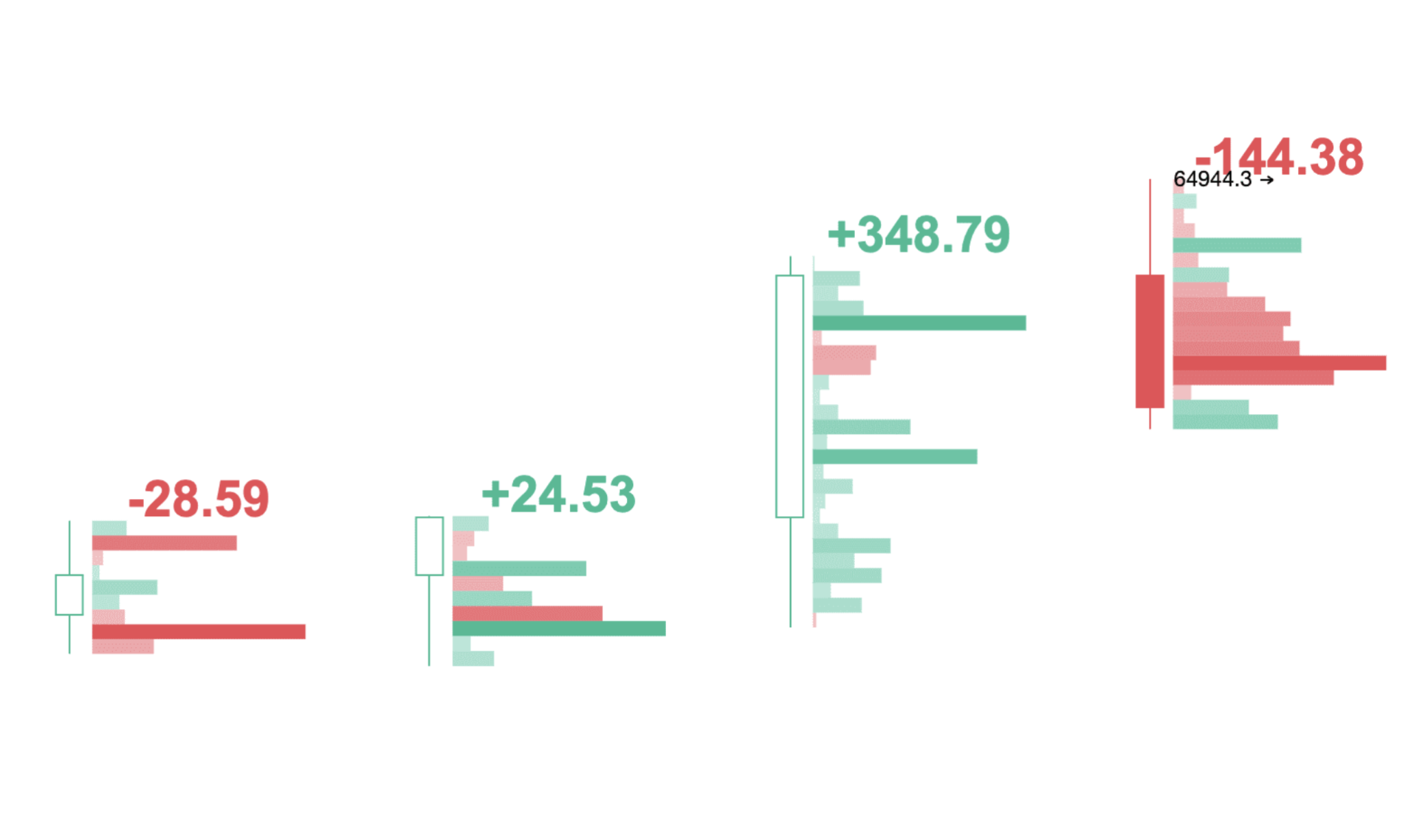
The number at the top of the chart is the Delta, which is used to calculate the difference between active buy and sell orders within a single candlestick.
If Delta is positive, it means more active buy transactions;
If Delta is negative, it means more active sell transactions.
The greater the absolute value of Delta, the more concentrated one side's market orders are in this candlestick.
Here’s a little question for everyone:
If Delta is positive, does it mean the market will definitely go up?
A: Yes
B: No, it depends on the final outcome of the price movement
The core of observing the footprint chart is to see whether, regardless of whether it is the buyers or sellers, they have truly achieved a price determination outcome after their efforts.
Let’s discuss some actual market scenarios.
Scenario 1: An upward pin bar with a significant positive Delta
Here, there are market orders actively buying, and funds are rushing in.
From the transaction data, the active buy pressure is strong, and it seems the buying side is very aggressive.
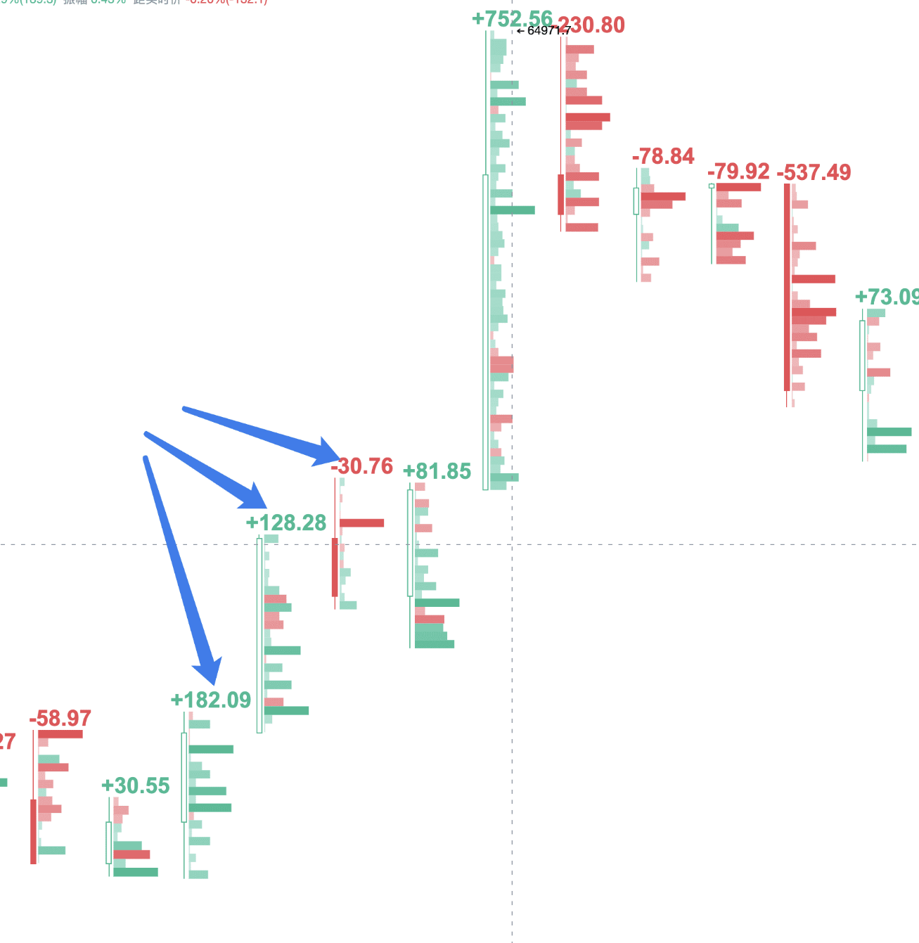
However, the final outcome is a bearish candlestick.
This means the buyers put in a lot of money to push up but failed to hold the price they established.
Normally, a strong buying attack would result in a bullish candlestick.
When this pattern occurs, it indicates that the incoming buying pressure is being absorbed by continuous selling pressure above.
If the price fails to regain the upper shadow area of this candlestick in the next 1-3 candlesticks, or if Delta turns negative, it basically indicates that this round of buying attack has failed.
The Delta in the image has turned negative, which is a typical signal of a buying failure.
Scenario 2: An upward pin bar with significant positive Delta
This pattern should be viewed in two different situations.
Situation 1: A long upper shadow but a solid bullish candlestick body.
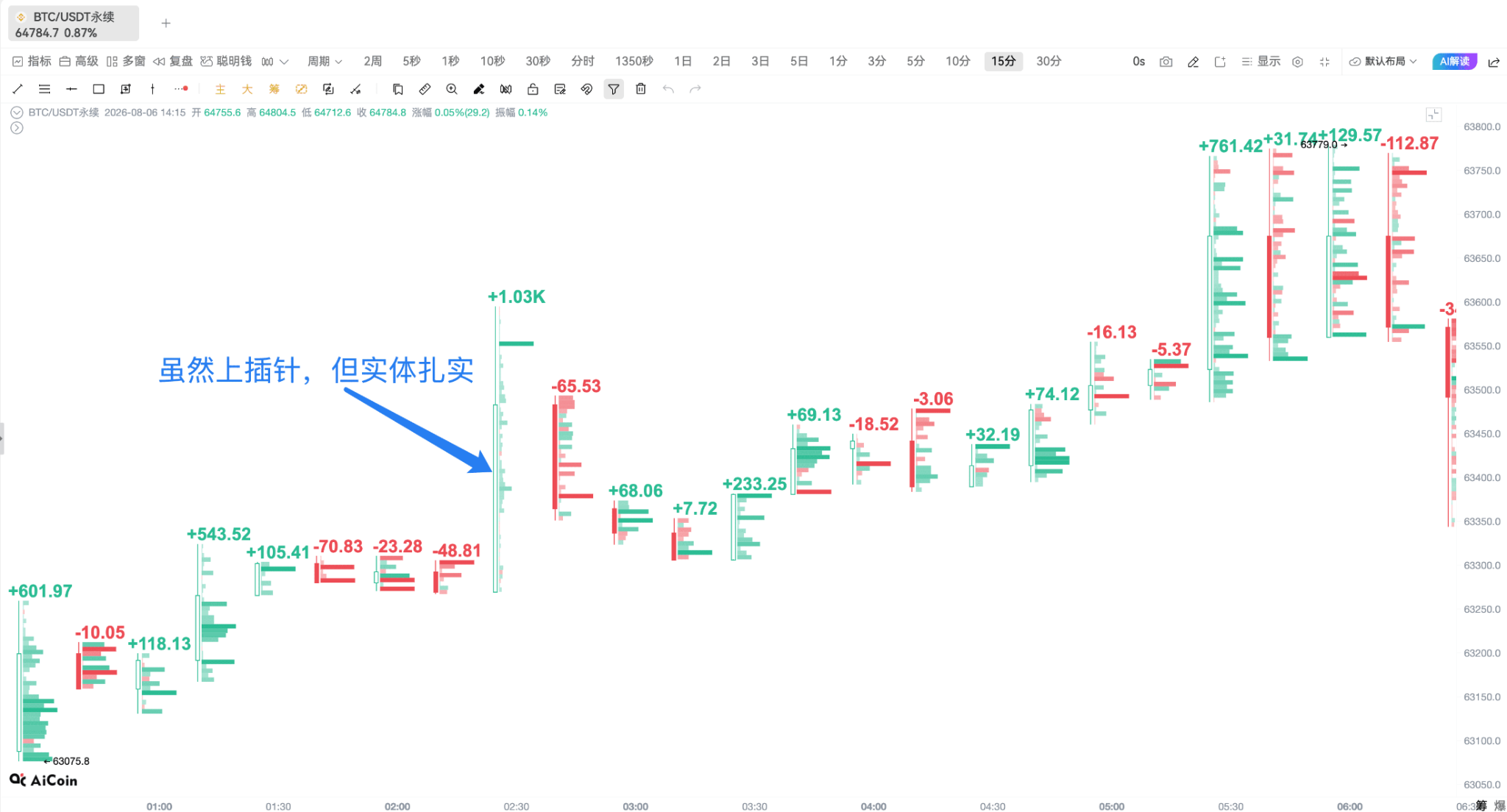
This shows that even though the buying side faced selling pressure from above, they still managed to maintain part of the pricing power, and the upper shadow is just a normal retracement.
As long as subsequent buying continues, there is still a chance for the price to move upward.
Situation 2: The bullish candlestick body is very small, and the upper shadow is very long.
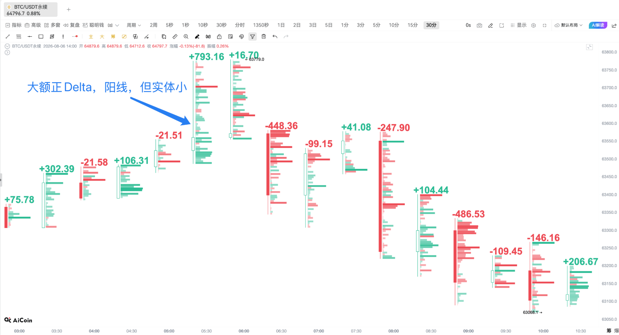
Even if the scale of active buying transactions is not small, the rise is being firmly capped by selling pressure from above, indicating poor quality of the buying attack.
If the price cannot recover the upper shadow area, or if Delta turns negative,
the market leadership will shift to the sellers, and you may consider going short in the short term.
At this point, can everyone keep up with the earlier content?
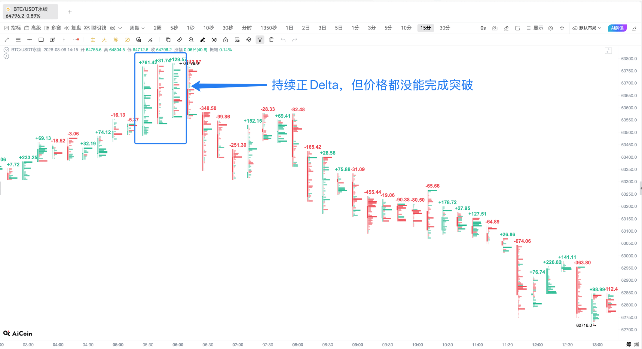
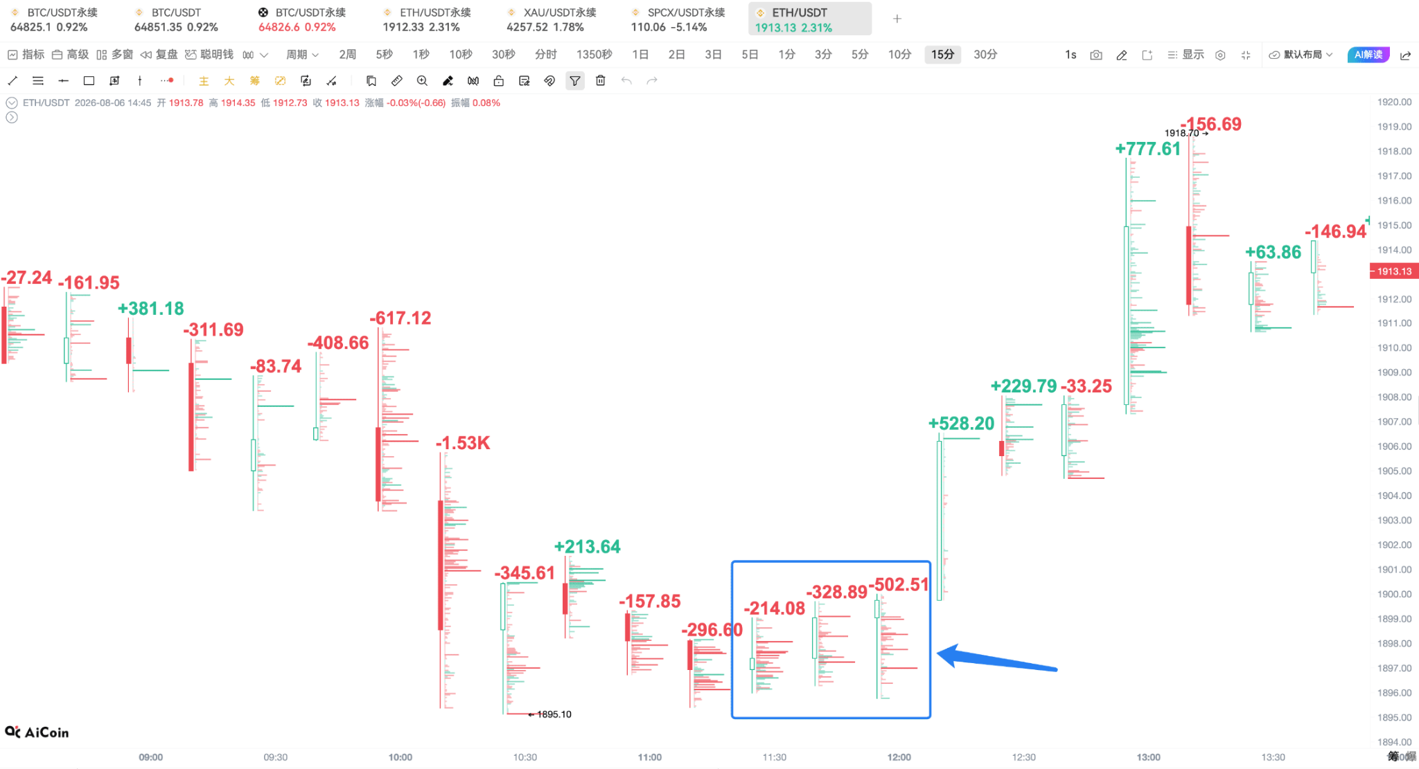
Let’s present two groups of sequential candlestick pattern signals.
First group: Delta remains positive, but the price is unable to break through resistance, and selling pressure is significant, indicating a short signal.
Second group: Delta remains negative, yet the market keeps producing bullish candlesticks; sellers are trying very hard to push the price down but fail, indicating a long signal.
The footprint chart is applicable to almost all cryptocurrency trading pairs; personally, I usually use a 15-minute cycle for contracts.
If switched to larger periods, these types of signals will be diluted.
Now let’s discuss two groups of double candlestick combination signals.
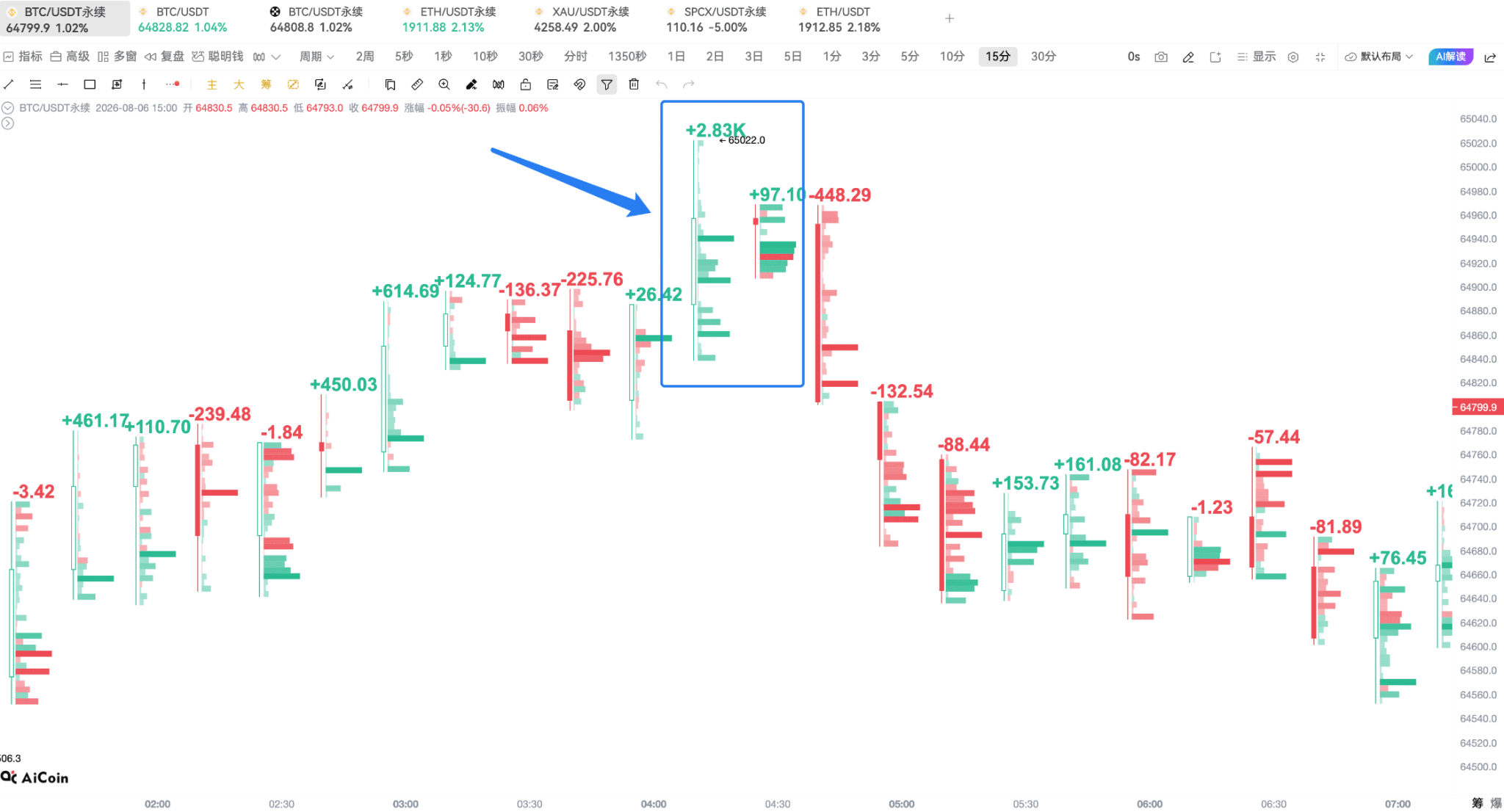
First type: The previous candlestick shows significant positive Delta, and the next candlestick sees a considerable decrease in Delta, even turning negative.
This indicates that the buying side lacks sufficient follow-through.
Once the subsequent Delta continues to turn negative, a short position may be contested.
Another similar pattern: a bullish candlestick accompanied by significant positive Delta, immediately followed by a bearish candlestick with the same level of significant positive Delta.
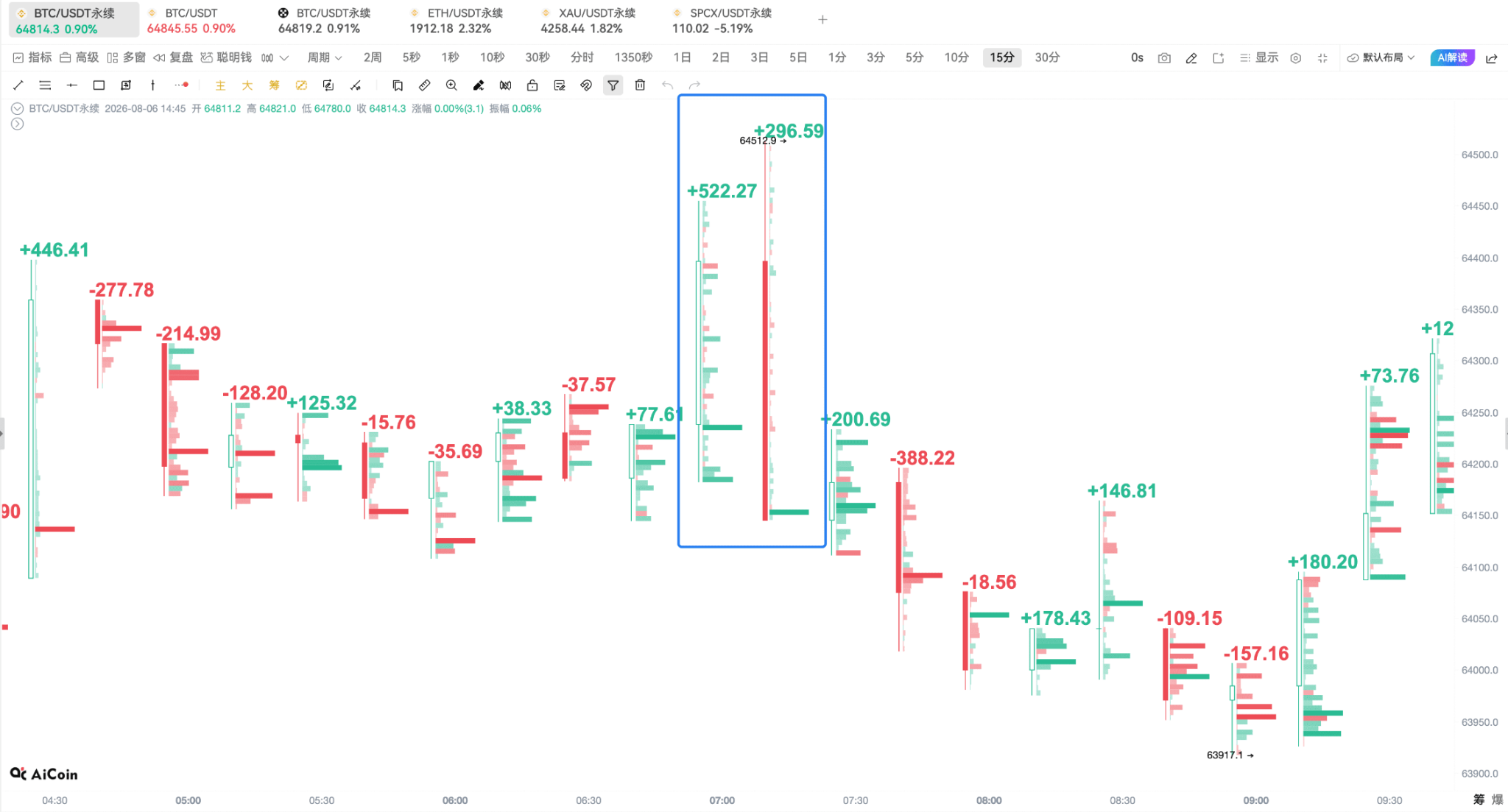
This is a signal that the buying funds entering the market are being fully absorbed.
If it just happens to appear near a resistance level, the reliability of the signal will be further enhanced.
Live textual broadcasts have significant limitations, and there are many details that cannot be explained all at once.
Due to time constraints, more practical content about the footprint chart will have to be discussed in the next live broadcast.
If you have any questions about this live broadcast's content, feel free to join our [Live Q&A Growth Community] for more discussions.
Returning to the footprint chart itself,
Friends who usually follow our news might have come across the market signals from the footprint chart that we have pushed.
This is not just looking at the charts and telling a story after the fact.
You can note these practical points:
- Positive Delta = more active buy transactions; Negative Delta = more active sell transactions
- More active buying does not necessarily mean the market will rise; it depends on whether prices have been truly pushed up
- More active selling does not necessarily mean the market will fall; it depends on whether prices have been truly pushed down
- Upper shadow combined with significant positive Delta indicates caution as buying pressure may be absorbed by overhead selling.
- Lower shadow combined with significant negative Delta indicates that selling pressure may be absorbed by lower buying.
Currently, we have live broadcasts every day, feel free to keep following the AiCoin community! Pre-register early 👇
https://www.aicoin.com/zh-Hans/live/list?tab=upcoming
Join our community to discuss and strengthen together!
Official Telegram community: https://t.me/aicoincn
AiCoin Chinese Twitter: https://x.com/AiCoinzh
Aster rebate: https://www.asterdex.com/zh-CN/referral/9C50e2
Hype rebate: https://app.hyperliquid.xyz/join/AICOIN88
Binance rebate: https://jump.do/zh-Hans/xlink-proxy?id=3 Invitation code: aicoin668
Coinbase rebate: https://jump.do/xlink?checkProxy=true&proxyId=25 Invitation code: Y8L23JL
免责声明:本文章仅代表作者个人观点,不代表本平台的立场和观点。本文章仅供信息分享,不构成对任何人的任何投资建议。用户与作者之间的任何争议,与本平台无关。如网页中刊载的文章或图片涉及侵权,请提供相关的权利证明和身份证明发送邮件到support@aicoin.com,本平台相关工作人员将会进行核查。